Gold is such a beautiful accent color and comes in a variety of different tones. From the more traditional yellow gold to the pale, more muted gold tones, it’s the perfect accent color for your home.
Gold is often considered opulent and is synonymous with luxury, wealth, and extravagance. Inside your home, it can be used in a variety of different ways to add a luxurious, classy, and sophisticated vibe. If used wrong, however, it can look a bit gaudy and dated.
To achieve elegance in your home with gold you need to know the right colors to pair it with. To help you do so we’ve constructed a list of some of the best colors to pair with gold, which will make your home interior look like the height of luxury.
Top 10 Colors That Go With Gold
From more neutral base colors to statement-rich color tones, gold pairs well with a variety of different colors. Using gold as an accent color means that you have a wealth of color options to use in your home that will fit your personal preferences and style.
Whether you prefer to keep it clean and simple or love injecting color into your home, gold is the perfect accent choice to help you achieve either.
Let’s get started by looking at the best colors to use with gold.
White
Starting with one of the simplest and most popular base colors, gold can be added to white rooms to help elevate the style and bring about an air of luxury and sophistication.
All-white rooms can often feel cold and airy, but gold accents and decor pieces can make the room come to life, and add a touch of glamor. It’s also a pretty useful trick if you’re in rented accommodation and unable to change the color of your walls too.
If your room is mostly white, you can break up the space by adding in some gold elements. For instance, white and gold wallpaper patterns, or accents painted with metallic paint can make the room come alive.
If you want to focus the gold solely on the walls then opting for white furnishings like bed sheets or sofas, cushions, and table lamps will make a room feel luxurious without overpowering the room with gold.
If you want to keep the walls white and incorporate gold in other areas of the room, that too can be easily achieved. Think gold photo frames, gold-accented coffee tables/nightstands, lamps with a gold base, gold trinket dishes, lighting fixtures, and vases.
To create more drama in the room without making it look or feel tacky you can experiment with different textures too. White feathered lampshades, frayed cushion covers, and furry rugs can be a great way to achieve this.
This simple color scheme has proven to work seamlessly time and time again and is a classic combination used for a variety of occasions. For instance, it’s a pretty popular color scheme for weddings, as it creates a pure and elegant vibe.
Although white and gold on it is a stunning color combination, it also works well with a third color. Hot pink, peach, turquoise, and gray are all colors that work seamlessly with a white and gold color combination.
If adding a third color make sure you stick to color ratios. Ideally, you want the room to be 60% white, 30% gold, and 10% of the third color.
Beige
Moving on to another highly popular neutral shade, beige and gold work so well together as the two are very similar in tone.
By pairing different shades of beige with gold, you limit the contrast in space, and it can make one room look cohesive. This color scheme is particularly useful for smaller rooms as pairing beige and gold plays a sort of visual trick.
As mentioned the two are pretty similar in regards to tone, so putting them together can make a small space feel a lot bigger than it is. Also using gold as an accent color can transform the space into a classier, more formal room, as beige on its own can often be a pretty casual color.
Gray
Continuing with the neutral color theme, gray and gold are a surprisingly pretty pairing. When people use gray as a base color they often pair it with silver, however, this can wash the gray out slightly and give the room a rather samey vibe.
An easy way to bring gold to life is to pair it with gold. Whether you choose a dark slate gray, or a softer toned gray, mixing gray with gold can create a stylish interior. Even mixing white with gray marble can look exceptional, and often creates an opulent and dramatic effect.
If you prefer modern, minimalist interiors, then pairing gray with gold can help you achieve this aesthetic with a sleek, stylish touch.
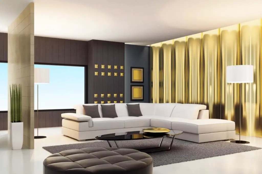
Black
The classic color combination of black and gold just screams luxury, opulence, and – of course – drama!
What is considered a basic color combination that is used frequently in fashion – black outfits with gold accessories – these two colors can be utilized in interior design too. As they’re perfectly suited to one another you can create a truly luxurious and elegant decor.
What can be tricky however is trying to find ways to make black and gold work together in a room. Luckily we have a few tried and tested suggestions for you.
Try using matte black paint on the walls to serve as a base. Like we mentioned with using white as a base, using gold frames for artwork can make them stand out. In addition, large, gold-framed mirrors can become statement pieces when paired with a black wall.
Keep furniture such as sofas, chairs, and bedding black too. But add in golden details such as cushions, candles/candle holders, trinket dishes, vases, and lamps.
Another highly stylish element you could consider is a glass coffee table with a gold frame. Not only do these tables look sleek, but they also serve as focal points. Especially when they are decorated with a vase of flowers and some aesthetic literature.
If you don’t feel comfortable painting your walls black – we get it, it can be a little intimidating – why not opt for gray color instead. You can incorporate the black and gold color scheme through soft furnishings and decor items elsewhere in a room.
Opting for gray walls can still feel elegant, however, it won’t have the same dramatic effect as black walls.
Brown
Although brown is often used frequently throughout a home, it rarely ever serves as a feature color, as it’s more of a neutral base for brighter colors. Even though wooden furniture is still extremely popular, brown is very rarely chosen as a wall color. However, in doing so you can create a stylish space.
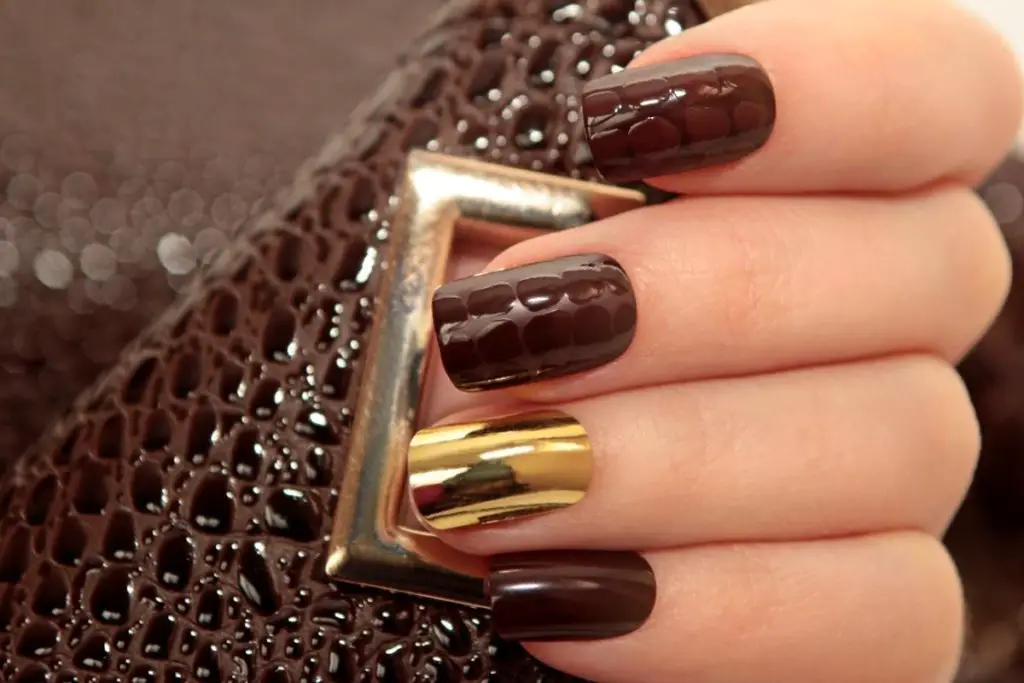
In fashion, brown is often paired with gold as the gold accessories make the tones of the brown appear richer, whereas silver is too much of a contrast. Like the simple black and gold color combination, this fashion “rule” can also be applied to home interiors.
When pairing brown with gold opts for deep, rich, dark brown woods, like mahogany. When paired with gold these furniture items can look rich, and stately. Also opting for heavier, solid wood pieces are a must, as these can make a room look grand.
As attention to detail, make sure any furniture has gold hardware. Golden handles and hinges on cabinets or drawers may seem like minor details, but they can help to create a cohesive look. These minute details can be further accented by using golden candle holders, photo frames, and lamps.
Brown and gold can create a pretty masculine look, and there are certain rooms in the house where this style will shine. Brown and gold are the perfect color combination to use in a library/study, home office, or snug room, and they also have an aristocratic vibe to them.
For an intimate feel opt for brown panelling on the wall. But if you’re intimidated by using rich, dark brown shades on the wall, camel and tan toned browns also work exceptionally well with gold.
Navy
Navy and gold are a sublime color combination, and you can use them together for several different effects and styles. If you’re into a nautical vibe, the two work seamlessly together, but if you want a classier look, they’ve also been used together for centuries in a regal way.
To bring that classic, regal look into the 21st century, using navy walls as your base and adding gold fixtures such as lights, mirrors, photo frames, and plant pots can create a modern interior, with a hint of drama.
Navy and gold even work beautifully together in bathrooms. Pick out some glossy dark blue tiles and use gold faucets, showerheads, and towel rails for that sleek look.
When a room has all walls painted navy with gold accents added to the room it gives off a sophisticated and intimate vibe. What’s worth mentioning, however, is if you opt for this color scheme be sure to use darker wood tones. This will complement the navy better and will help keep the look of a room feeling cohesive and well put together.
If you want to use navy and gold in a completely different way, then adding white can give this color combination a completely different feel.
For instance, if you’re a fan of nautical/coastal style interior, then keeping your walls white and adding statement navy furniture pieces – such as sofas and curtains – with touches of gold can help achieve that beachside house vibe.
Purple
Sticking with the rich, deep color tones, let’s move on to purple.
Like Navy, purple is also considered a regal and luxurious color, especially when paired with gold. Opting for deep purple tones like plum or aubergine can help to emphasize this “royal” pairing, and create a dramatic look – perfect for those who love to make a statement.
One of the best rooms in your home to use this majestic color combination in the bedroom. When combined, purple and gold can create an intimate vibe, which is perfect for bedrooms. Opting for deep purple walls and littering your room with gold accents will create a space fit for a royal.
This exquisite combination also pairs beautifully in a dining room. Again opt for a deep purple shade to use on the walls. For gold accents use cutlery, candlestick holders or candelabras, lighting fixtures, and photo frames – this will create a feeling of luxury.
If you’re looking to put some emphasis on “luxury”, pairing different fabrics can help to create that feel. Think of fabric textures that pleasure the senses (touch, sight). Silk and velvet are perfect examples of “luxurious” fabrics, and varying fabric textures in a room can not only create a dramatic look, but it also scream opulence.
In terms of which gold tone you should pair with purple, the options are endless. However, we recommend using more yellow-toned or orange-toned gold colors.
As yellow and orange are both complementary colors to purple when paired together these colors elevate one another. Even copper-toned gold pairs with purple well.
Dark Green
Rich, dark green shade colors have been a big player in interior fashion for a while now, and there’s no sign of it going anywhere anytime soon.
Like navy and purple, pairing emerald green shades with gold gives a luxurious and opulent feel to a room. This dream color combination works well in almost every room in a house; bathrooms, living rooms, dining rooms, bedrooms, and kitchens.
As previously suggested, for the best effect paint your entire room in an emerald green color. If you’re using the gold-green color combination in bathrooms or kitchens there is a beautiful array of glossy forest-green tiles that will bring these spaces to life.
Once you have the green down as a base, begin adding your gold accents. Not only will the previous accents like lighting fixtures and photo frames give that glamorous vibe, but choosing gold metal furniture or gold leaf artwork will look sensational.
Mixing fabrics will once again create a dynamic look, but adding patterns can be another stunning way to explore this color combination.
Right now jungle-themed patterns are in. Think of banana leaves, Monstera plants, and palm leaves. These beautiful large leaves bring the rainforest look to any home, and their rich, dark green color looks sensational.
Why not opt for a tropical leaf wallpaper? Pair it with dark green furniture such as sofas and bedspreads. If you want to vary your shades of green, try and keep your gold tones as similar as possible to create cohesiveness.
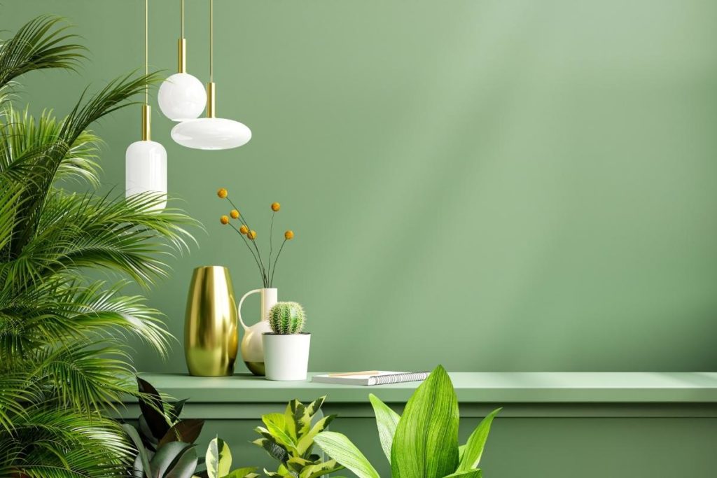
Sage Green
We’re going to continue with the green theme, but instead suggest the paler, muted sage green color. Just like darker green shades, sage green is all the rage right now, especially in home interiors. It’s also less intimidating to use than some of the darker, bolder shades we’ve suggested so far.
This shade of green has an earthy tone if you’re into more natural-looking colors, and works as the perfect neutral base. It also has some gray undertones, so pairing sage green with gold works so well.
If you want to give a pale green room an element of sophistication, we recommend pairing it with gold. This can add a more formal feeling to a space and can be achieved with gold accents such as photo frames, candles, trinkets, and gold metal furniture.
This particular color scheme works exceptionally well in living rooms or dining rooms. As these are the areas of your home where you typically entertain guests, sage green and gold are a classy combination.
If you’re looking for a way to incorporate these colors into a specific interior style, sage green is an increasingly popular color featured in cottagecore design styles. Cottagecore typically brings the outside inside, and this particular shade of green helps to achieve that.
Pair with some rustic pieces of furniture and the style can easily be achieved. Also, as sage green is such a pale color, like white it can help to make a space feel bigger than it is, but also provides warmth to a room, whereas white can make it feel cold.
Blush Pink
For our final color, we’ve opted for a light shade of pink. Just like sage green, blush pink is extremely popular right now, not just in home interiors but in fashion too.
Most people shy away from using pink in their homes, afraid of its tacky use in the 2000s and 90s interiors. However, by picking the right shade of pink you can create an elegant space, and that’s where blush pink comes in.
Pairing it with gold also creates a sophisticated look, but you’ll want to avoid harsh yellow-toned golds and opt for lighter, more muted gold finishes.
By adding gold accents to a blush pink space you can make a room feel bright, cohesive, and mature – completely avoiding the childish look that pink is often associated with.
This color combination is perfect for bedrooms and living rooms. As with previous suggestions try mixing different fabric textures to add variety whilst also maintaining balance. For example, a blush pink velvet sofa is a statement piece and can make your room look stylish and trendy.
Blush pink and gold even work in bathrooms and kitchens. Painting cabinet doors and adding gold handles and faucets will create a space that looks like a Pinterest picture.
Final Thoughts
So there you have it! Our top picks for some of the best colors to pair with gold in your home. Gold is a color often associated with luxury, opulence, and sophistication, so using it in your home can elevate your spaces.
If you want more drama, opt for a darker color to use as your base such as black, purple, or navy. However, if you want to create an open, brighter space, choose lighter tones like white or sage green.
Remember you can also pair gold with two or more of these colors at once, particularly if you use white as one of your primary colors. This can add more dimension to a space. You also shouldn’t forget to mix fabrics, as these can add texture to monochrome-looking spaces.
I’m Ida Oliveira, and now I want to impart my knowledge of all things interior design onto you. If you’re going through the same process of designing your house, I want to help.
So, I hope that you’ll find everything you need to know on my website. If I make the process even a little easier and more fun for you, Alexander and Pearl will have done its job.

![ow To Design A Room Like An Interior Designer [Step By Step]](https://alexanderandpearl.co.uk/wp-content/uploads/2022/02/How-Much-Does-A-Pop-Up-Camper-Weigh-33.jpg "How To Design A Room Like An Interior Designer [Step By Step]")


")

