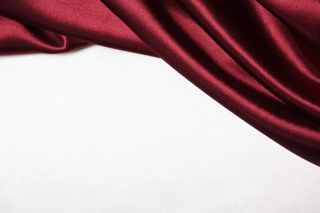
Technically, it’s considered a shade of brown in hex color charts used by web designers. In fact, the name maroon comes from the French word “marron”, which can be translated both as “chestnut” or “brown”.
But enough about the technicalities – you know what maroon looks like, and you know that it’s a great color to use when you’re decorating your home.
But what colors to pair it with? Good question, but luckily there’s a whole world of colorful possibilities for finding your maroon a best friend. That’s what we’re going to look at in this article, so read on!
1) Maroon And Red
These two aren’t all that different to start with, being in the same family of colors.
Since maroon can be considered a darker shade of red, it’s best if you choose a lighter shade of red to pair it up with.
A great example of these two going well together is in the designs of traditional oriental rugs. Getting an oriental rug can be a great way of adding color and depth to tie a room together, particularly if the rest of it is in more neutral colors.
Of course, oriental rugs do come in a variety of colors, so you might have to do a bit of hunting to find the exact color combination you want.
2) Maroon And Green
Maroon and green are complementary colors. If you look at a color wheel, you’ll find that the two are opposite each other. This means that they’re prime choices for putting together in all kinds of ways.
Of course, there are many shades of green to consider. For maroon, the best thing to do would be to pick a bolder color like emerald green. This is the perfect complement to the richness of maroon, but it can be made even more appealing by using some accents as well.
Accent colors can brighten things up a bit – you could try gold or silver, for example.
Lighter shades of gray will add brightness to the rich darkness of maroon, while darker shades will intensify it.
While you can go down this route, take care not to let the maroon/gray combination overwhelm the room if you want to use a dark gray. This can be done by not using too much of the gray color – perhaps use a smaller piece of gray furniture with a maroon wall, for example.
4) Maroon And Black
This combination can work well, but you need to be aware of the same thing as in the last paragraph – maroon and black together are both rich, dark colors that can easily overpower a room if you’re not careful.
This means you’ll need lots of support from brighter accents if you want to get the best out of this color combination.
The 60-30-10 rule works nicely here. This means using a neutral color like white or cream for the foundation of the room, making up about 60% of the color in the space. You can then use black for 30% and finish it off with 10% of maroon.
A black sofa with maroon cushions might fit the bill here, for example.
5) Maroon And Orange
This is definitely an unorthodox combination, and not many people usually think to put orange and maroon together. However, don’t let that fool you into thinking that it can’t be done, because it certainly can.
Depending on the shade, orange can have a deep richness to it that’s quite like maroon. In that case, you’ll want to make sure you don’t overdo things, but in the correct amounts, the combination can add a lot of warmth to a room.
6) Maroon And Blue
Blue can complement a wide range of colors, including maroon. However, the lightest shades of blue can make the room seem washed out.
To avoid this problem, you should opt for either medium or deep blues. If you’ve seen someone wearing a maroon shirt or sweater with a pair of dark blue jeans, then you’ve got an idea of how the two colors can work together.
It doesn’t have to be limited to clothing, though. A maroon armchair with a navy blue cushion can look great, as can a maroon tablecloth with a dark blue runner across it.
7) Maroon And Teal
Teal is in that kind of half-space between blue and green. Luckily, since both of those colors can be made to work quite convincingly with maroon, teal can too.
A lot of the same rules apply as well – don’t pick a shade that’ll wash the maroon out, go for something bold. Since the colors are so different, you can afford to pick a color that stands on its own like that.
8) Maroon And Mauve
Mauve is often considered a brightening accent color that brings energy into the room. This can often involve moving away from any browns or tans that were initially present, so people often try not to sit them right next to each other.
But, even when they do, you can still find ways to make the two work together harmoniously.
An example would be to use a lighter shade of mauve that makes more of a contrast against maroon than just a darker tone.
That said, a darker shade can work as well, though if it’s too dark, and you use too much of it, you might crowd the room with too much color.
9) Maroon And Pink
Pink is another color that tends to lighten all other colors around it. As such, it needs to be used sparingly.
When you see pink in a room, generally speaking, there isn’t going to be enough of it to make anything feel truly pink. Unless you want it to be, of course, but most people find that pink is best used sparingly.
Plus, you also don’t want to rely entirely on pink to bring your desired effect. Instead, you will want to use pink in conjunction with some other colors.
This is where maroon will help you. It doesn’t pair best with a light, candy pink. Instead something like a rose pink will work better.
10) Maroon And Cream
Cream is another popular choice for adding texture and dimension to a space, especially when paired with a darker color, like maroon.
The reason why this works so well is that cream provides depth without requiring you to use large quantities of it.
Plus, it can actually give the impression of something being heavy and substantial, which is perfect when used along with marble flooring and solid wood furniture to achieve a feeling of weighty luxury.
In general, however, when you’re looking to add cream elements to a space, you want to choose a shade that’s closer to white than yellow. This is because the point of cream is usually to provide a sharp contrast with another color, and being lighter will help it to do this better.
11) Maroon And Yellow
Yellow is a classic choice for the home. You could probably count on one hand the number of times you’ve ever heard someone say they didn’t like yellow.
As a result, many designers know how important it is to have at least one yellow element in their rooms to help balance everything else.
Luckily, it’s a great match with maroon. It can make a really nice, autumnal style mix – the brownish red maroon and the tree leaf yellow making it seem like Fall in your home.
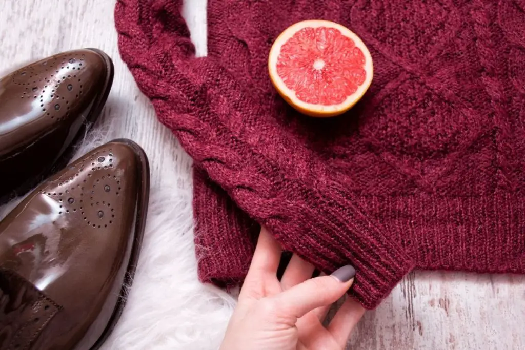
12) Maroon And Burgundy
Red and burgundy are both colors associated with royalty. They can be effective when combined in small doses, since when you pair them closely together they tend to add quite a lot of richness.
Since the two colors are so similar, one possibility here is to blend them into each other. This might be doable with something like a rug or a wall hanging. This can stop the color from looking like too much of a block and add depth to a room.
Match that with a more neutral color, and you’ll have a well-balanced room with an attractive look.
13) Maroon And Brown
We’ve already mentioned that maroon can be considered a shade of brown. This means that it can blend into brown quite well, just like burgundy.
You can try something similar with a rug or wall hanging, or even get a sofa of one color and match it with cushions or a throw of the other. Again, though, it might be a bit much if you don’t have something lighter to balance it out.
14) Maroon And White
White is the definitive neutral color, which means that it can be made to work with just about anything. Maroon is definitely no exception. Keeping some white in the mix can ensure that whatever else you do with maroon or any other colors, it won’t get too overdone.
White will keep the room centered and balanced for you. For instance, if you have a room painted white, you might choose to have maroon curtains, or maybe even just maroon lampshades. It depends on how much maroon you want to add to the equation.
15) Maroon And Gold
You certainly won’t want to go overboard with gold. If you use too much of it, then your room will end up looking tacky and one note, which isn’t any good.
However, gold really shines as an accent color, and one of the other colors that it can give a boost to is maroon. Cushions or runners with gold trim are perfect examples here, but there are other examples where gold works well too.
Why not try a maroon wall with paintings in gold-trimmed frames hanging on it? We’ll stress again that a little does go a long way when it comes to gold, but it’s something you definitely shouldn’t neglect when you’re trying to pair maroon.
Final Thoughts
All those listed above are very good choices for decorating a room in your home, and can easily be adapted to fit any type of interior decoration and personal taste.
However, the truth is that every single person has their own preferences when it comes to choosing various patterns. Some prefer bolder patterns, while others gravitate towards subtlety.
Either way, there should always be some variety in a design scheme to keep things interesting.
Maroon is a versatile color that can be made to match all kinds of others – it’s just a question of knowing how much to use, in which place, and in what combinations!
I’m Ida Oliveira, and now I want to impart my knowledge of all things interior design onto you. If you’re going through the same process of designing your house, I want to help.
So, I hope that you’ll find everything you need to know on my website. If I make the process even a little easier and more fun for you, Alexander and Pearl will have done its job.

![ow To Design A Room Like An Interior Designer [Step By Step]](https://alexanderandpearl.co.uk/wp-content/uploads/2022/02/How-Much-Does-A-Pop-Up-Camper-Weigh-33.jpg "How To Design A Room Like An Interior Designer [Step By Step]")


")
")

