There’s nothing quite like a fresh coat of paint to give your home a whole new lease of life.
Who knew that just changing the walls of your home would completely transform it into something beautiful, new, and completely different?

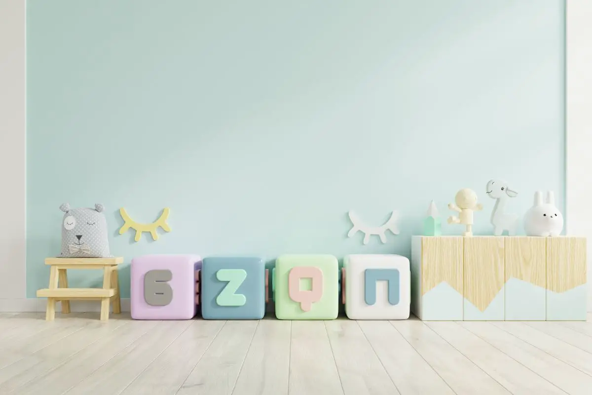
And while there are many, and we really mean many, different shades to choose between, there’s something about a blue-green color that just looks phenomenal.
Benjamin Moore’s Palladian Blue looks its best, in our humble opinion, in smaller spaces such as bathrooms, as the color’s hue is relaxing and spa-like, making for a calming bath time experience.
But hey, at the end of the day, the choice is completely yours! This beautiful sea-like color can work well in any room you choose, given the right lighting and decor.
So, let’s take a closer look at this gorgeous color and how it will work in your home.
What Color Is Palladian Blue?
It’s always important to understand exactly what color paint you’re buying before you purchase it, right?
After all, sometimes those paint tins can be deceiving. And it’s not just the tins…
With the name Palladian Blue you’d probably be expecting a blue shade, right? Well, kind of.
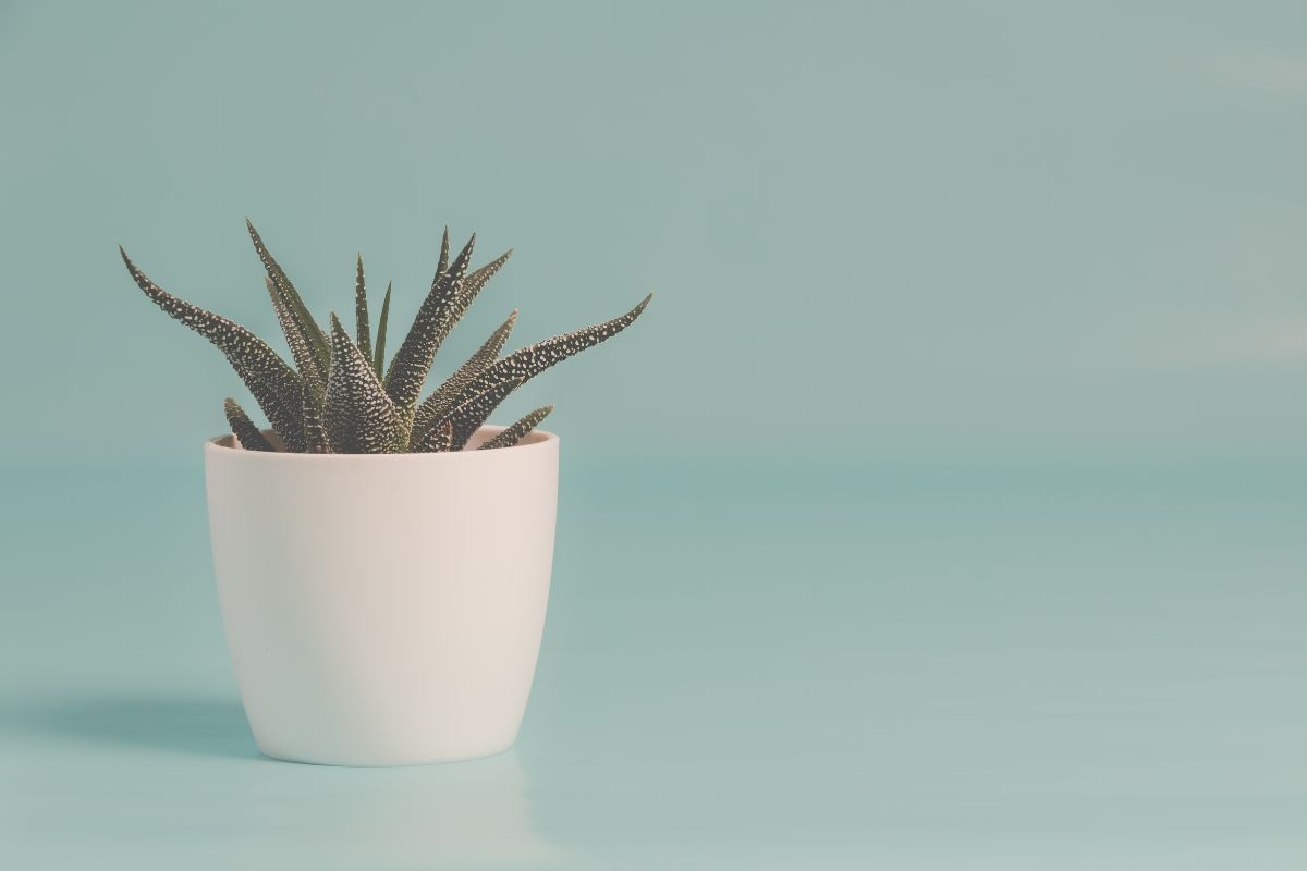
Palladian Blue is blue, for sure, but it also has some pretty noticeable green hues to it too. So it would definitely be classed more of a blue-green than a true blue shade.
Is Palladian Blue More Blue Or Green Dominant?
Okay, so the next question you probably have is this: is Palladian Blue more blue than green or more green than blue?
And that’s actually quite a difficult question to answer. You see, there’s no clear-cut answer to this question because there are so many differentiating factors that can influence its appearance.
So, for example, both the lighting of the room and the decor that you place in the room can make Palladian Blue read more blue or green.
Say you use Palladian Blue in a bathroom with little natural light and tons of blue accents, then it’s going to come off pretty blue-dominant.
However, in a room with natural lighting aplenty and a few green pieces of decor, then it’s definitely going to have a stronger green hue.
This is why test colors exist.
You should never commit to a color before trying it out on the walls first, because you may come to find that it is not quite the right color after all depending on those influencing factors in your specific home.
What Colors Should You Pair With Palladian Blue?
Good news – since Palladian Blue is a combination of two colors, it gives you a lot more room to play around with other colors in your room.
And in fact, when it comes to this stunning shade, there’s a whole host of different options to choose from.
Below you’ll find some of our top recommendations!
- Sherwin Williams Passive – This color pairs amazingly well with Palladian Blue since it has a blue undertone that matches it perfectly. The gray itself is also medium-depth and works great as a neutral color that makes your brighter shade pop.
- Benjamin Moore Aegean Teal – If you’re looking for a color that is still somewhat neutral but has a bit more color to it, then you can never go wrong with this Aegean Teal. This dark blue-green color pairs fantastically with Palladian Blue to create a super pretty and sleek color scheme.
- Benjamin Moore Classic Gray – This color works best for those hoping to achieve a neutral color that brings out Palladian’s more greenish hue rather than its blue. The overall product of this color combination is absolutely flawless.
- Benjamin Moore Van Courtland Blue – This medium-toned blue is pretty close to a true blue with just a tiny hint of a green undertone that pairs really nicely with Palladian Blue.
- Benjamin Moore Hale Navy – This stunning deep navy works an absolute dream with Palladian Blue and creates a stunning light and dark contrast.
- Benjamin Moore White Dove – Honestly, you’ll struggle to find a white shade that Palladian Blue doesn’t look good with. But of all the white shades out there, White Dove has to be our favorite.
- Farrow & Ball Stiffkey Blue – This inky blue is honestly gorgeous and would make a great addition to any room. Pair it with Palladian Blue and it’s absolute perfection.
Making Palladian Blue Work Well In Your Home
Even more good news for you today, blue and blue-green shades, in general, are pretty easy going when it comes to making sure they look good in your home.
They usually look great with most different types of decor and so they fit right in no matter what your aesthetic.
With that being said though, there are always a few rules to follow to ensure that it looks its absolute best, so, let’s go over the ways you can be sure that this color will look great in your home.
If you’re using Palladian Blue in an open-concept space, then a complementary neutral color is usually the best way to go.
And while it will most likely work with any neutral color, it will work better with some rather than others.
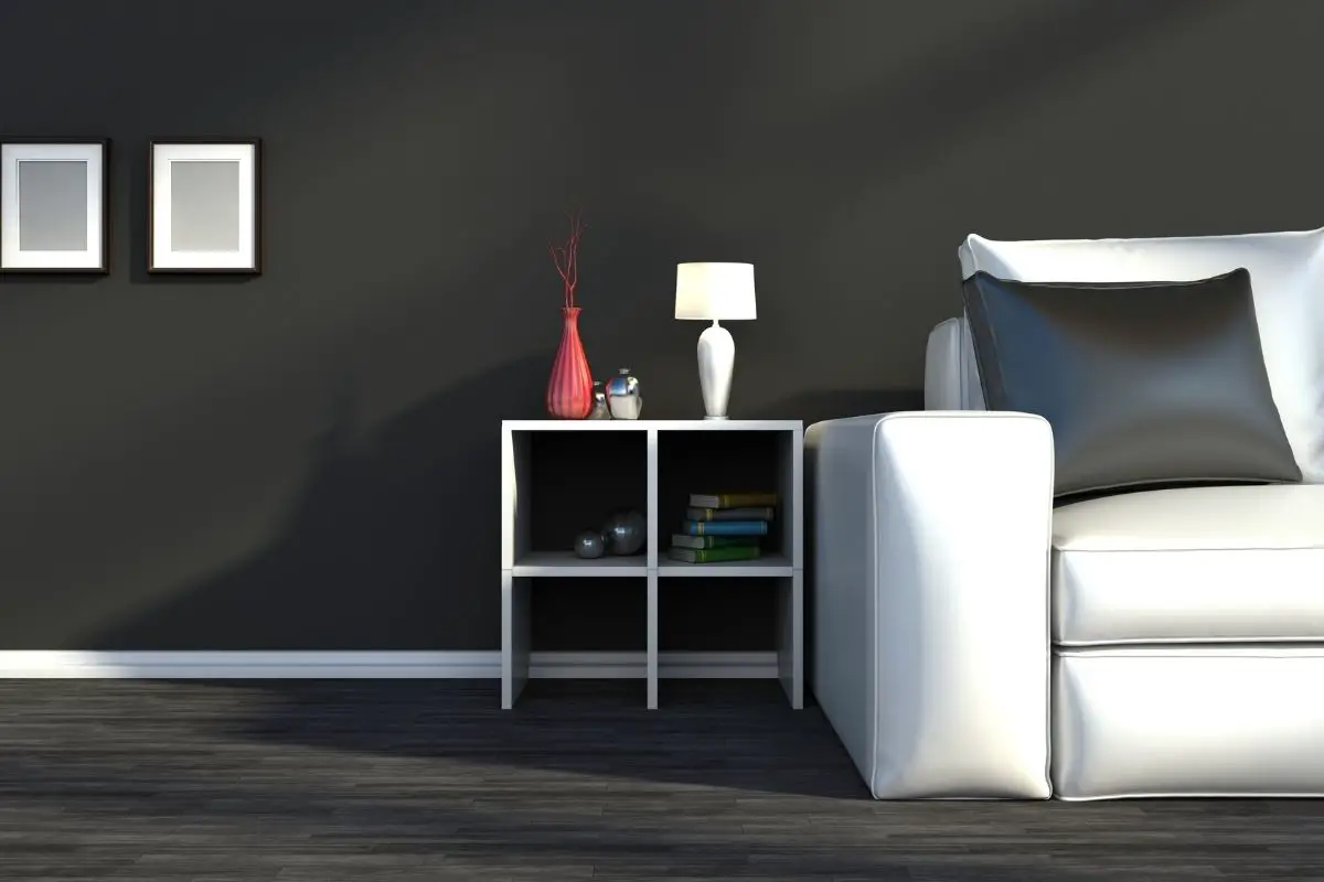
Generally, we’d advise staying clear of any grays that have a purple undertone to them, the two colors tend to clash a little.
However, grays that have a slightly bluish or greenish undertone are a match made in heaven with Palladian Blue.
Beiges also work quite well, if you’d prefer this to a gray neutral color.
Just try to stick to beiges that have a slight green undertone so that they match well with your blue-green paint shade.

What’s A Lighter Shade Than Palladian Blue?
Do you adore the Palladian Blue color but find that it’s just a bit too saturated for your room? Then you’re going to want to find a very similar color in a slightly lighter shade.
In this case, Benjamin Moore’s Healing Aloe might be the perfect option for you. In terms of color, it’s almost identical, being a stunning blue-green shade.
However, it is much lighter which means that you can still achieve that same look in a less saturated manner.
Wythe Blue VS Palladian Blue
Okay, so Palladian Blue and Wythe Blue are very similar colors. They have almost identical blue-green shades to them that are just so stunning and pretty.
The only major difference between them is that Wythe Blue is a lot darker.
Wythe Blue may be the perfect option for you if you’ve fallen in love with the Palladian Blue shade but found that the natural light in your home reduces its bluish hue.
The darkness of Wythe Blue stops the natural light from washing it out as much.
Sea Salt VS Palladian Blue
Sea Salt is a very pretty lighter shade that might pique your interest if you found yourself head over heels for Palladian Blue.
However, it is very important to note that Sea Salt isn’t actually all that much of a similar shade. At least, not once it’s on your walls.
Sea Salt has a much more distinctive green hue to it that will, in most cases, always outshine its bluish hue.
However, if you are looking for a shade somewhat like Palladian Blue that has a more green-dominated element, then you won’t find a better choice.
Never Forget To Do A Paint Test
Before we leave, we think it’s really important just to remind you again to always do a sample paint test before you ever commit to a color.
As we’ve mentioned above, pretty much all paint shades will look slightly different in each individual’s house.
And just because you’ve fallen in love with the color at the store doesn’t automatically mean you’ll be equally enthralled once it’s on your walls.
The lighting in your house may change the shade or the decor might bring out different hues that weren’t noticeable before.
Doing a paint test before you commit allows you to ensure that you’ve definitely made the correct choice.
Final Thoughts
And there you have it, you now know everything there is to know about the sleek, stylish, and downright stunning shade of Palladian Blue.
From what colors it works best with to how to make it work well in your home, you’ve learned it all!
So, do you think that Palladian Blue is the shade for you? Then do a paint test today!
- Benjamin Moore Palladian Blue Paint: A Color Review - September 5, 2023
- 10 Of The Prettiest Interior Door Colors - August 29, 2023
- Hale Navy: The Best Navy Paint Color - August 22, 2023

![How To Design A Room Like An Interior Designer [Step By Step] ow To Design A Room Like An Interior Designer [Step By Step]](https://alexanderandpearl.co.uk/wp-content/uploads/2022/02/How-Much-Does-A-Pop-Up-Camper-Weigh-33.jpg)


