Red is a color that goes well with almost anything. From clothing to furniture, red is a great choice. But did you know that there are other colors that go well with red? Let’s take a look at some of them.
Red is a warm, bold color that attracts attention. It’s often associated with love, passion, and romance. If you want to wear something that makes you stand out, then red is the way to go.
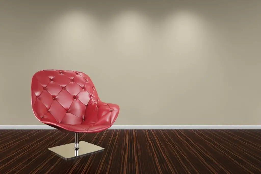
There are many ways to incorporate red into the decor of your own home. You can use it as a primary color in a room, or you can pair it with another color for a more subtle effect.
The Many Shades Of Red
Red comes in so many shades, and it is important that you choose one that works best for you.
There are two main types: dark and light. Darker shades tend to be warmer than lighter ones. When picking between these two, pick the one that will best suit your style.
If you like bright, bold colors, then select a darker shade. This will make your space feel larger and brighter. If you prefer softer tones, then select a lighter shade.
These will give your room a calmer feeling. If you have a small space, then you may not need to worry about picking a specific shade. Just pick a rich, deep red and let it speak for itself.
You don’t always have to stick to just one type of red, either: mixing both dark and light shades together gives your space depth and dimension.
These are some of the nicest shades of red that you could use while decorating your home.
Burgundy
Sometimes known as ‘French Burgundy’, this is a classic shade that has been around forever.
It’s a medium-dark reddish-brown, with a hint of purple.
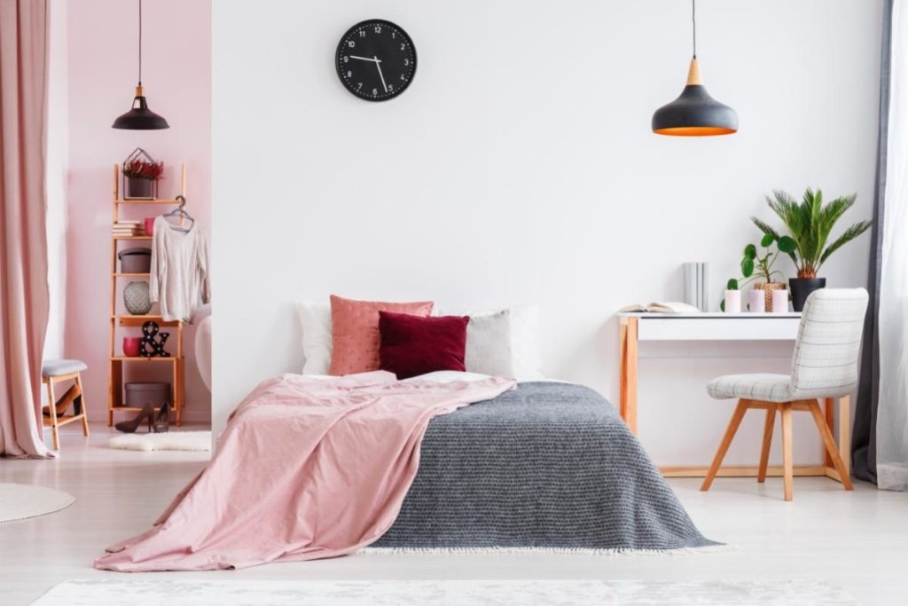
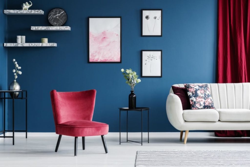
This traditional shade looks good on any surface, from walls to floors, and goes well with dark blues and grays.
Maroon
This is a very popular shade, very similar to burgundy.
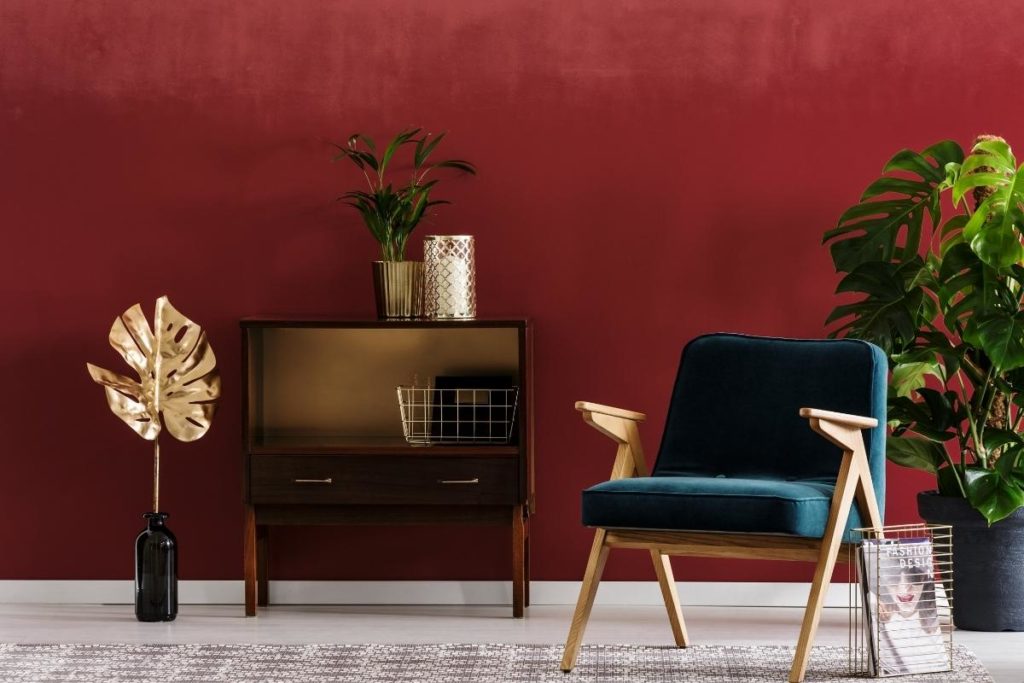
Maroon is a deep, dark red, usually found in the darkest shades.
It works well in rooms where you want to add drama, but still, keep things somewhat calm. This shade works best in rooms such as living rooms and dining areas.
Cherry
Cherry is a beautiful, soft shade with hints of pink. It’ll work well in a bedroom, or smaller rooms, because it creates a calming atmosphere.
The cherry color is a nice complement to the pink and purple hues that are common in bedrooms.
Wine
This is a medium-light reddish brown. Again, this shade is similar to burgundy but slightly lighter.
Wine pairs well with everything from wood to leather and goes well with colors like blue and gray. It is best used in rooms that feature natural elements, such as wood or stone.
Crimson
This is a vibrant, deep red, and it’ll make a statement in any room. It’s perfect for adding character to a living room.
It’ll also look amazing in a bathroom. Some of the colors that work well with crimson are orange, purple, pink, and black.
Ruby
This is a lovely, medium red, and It’ll help bring warmth and life to a room. It’d be a great addition to a kitchen or dining area and works well with pinks, purples, and black.
Ruby is a great choice if you want to create an inviting space.
Scarlet
This is a bright, vivid red with a tint of orange. It can be perfectly complemented by colors such as yellow, orange, and white, making a wonderful contrast against these colors.
Scarlet is a great choice for a nursery or even a kid’s room.
These are all beautiful shades that work well with any kind of decor. They also help to create an inviting atmosphere, depending on how you use them and pair them with other shades and colors.
You should definitely consider using at least one of these shades when decorating your home!
The Best Colors That Go With Red
Red is a powerful color. When combined with other colors, it can really change the entire mood of a room. In fact, red is often considered the most powerful color there is.
That said, it doesn’t mean that you need to stick to only one shade of red. There are many types of red, and each one will give off a unique vibe. As we’ve seen, there are many shades of red, each with its own unique characteristics.
However, unless you have decided on an all-red theme, you will need to think about which colors go best with your chosen shade – or, shades.
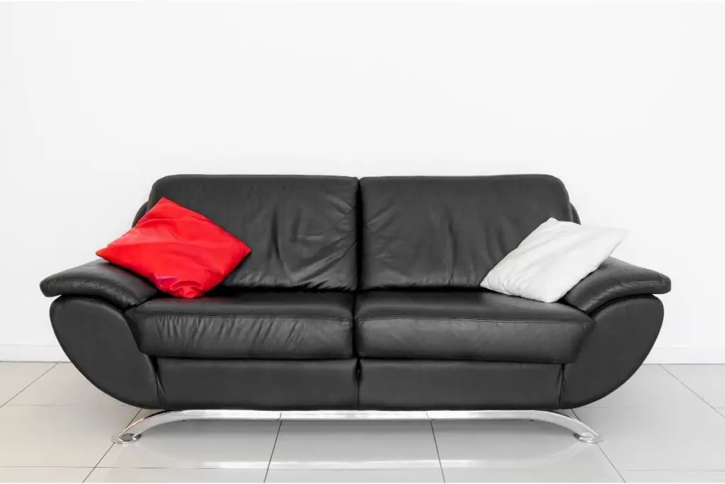
If you’re searching for the perfect pairing to create a gothic vibe, then black and red might just be what you’re looking for.
Black is regularly paired with red, and they both look fantastic together. Black is a versatile color, so it’ll work well in almost every room in your house. Use it in a small space, such as a hallway or entryway, and it’ll feel elegant and sophisticated.
Black is a neutral color that doesn’t distract from the rest of your decor, so when it’s used with red, it looks great. Black is also typically paired with gold accents, and when this trio of colors is used, it creates a very luxurious effect.
Just be careful while using black and red together, as the dark colors used together could create a gloomy vibe. This is why some people prefer to only use black and red together in certain spaces, instead of everywhere, or will utilize a lighter color to balance out the darkness.
For a more cheery vibe, consider pairing black with a cherry red hue. The two colors compliment each other beautifully, creating a warm and welcoming appearance.
If you’d like to add a bit of a gothic ambience to your home, try using a deeper shade of red, like burgundy.
White
When it comes to pairing red with white, there’s no right or wrong answer. White goes with everything, and it’s a classic combination.
It’s easy to see why white works so well with red. Both colors are bold and vibrant, but they don’t overwhelm each other. Instead, they harmonize really nicely. White is also a neutral color, meaning it won’t clash with anything else in your home.
You can use white with any shade of red, but if you want to keep things simple, choose something light. A bright white will make a statement, but a subtle white will blend into the background much better.
A darker shade of red would overpower a white backdrop, whereas a brighter, lighter shade of red will work perfectly.
The only issue that you may want to avoid while pairing red and white is that it can create a festive atmosphere: this will look great during the winter months, but not so good during the summer. You can avoid this by picking a darker shade of red, or incorporating another color into the mix.
Red, black, and white used together can create quite a striking image. This is a timeless combination that never fails to impress.
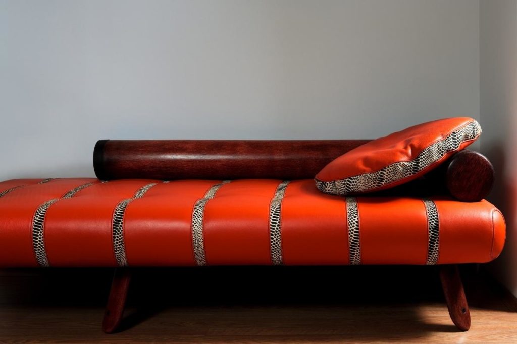
Orange
If you’re looking for a fun, energetic vibe, orange should definitely be at the top of your list. It’s one of those colors that makes everyone smile!
This color has a lot going for it, especially when paired with red. Orange is a happy color, which means it’s ideal for creating an upbeat mood in your home. When combined with red, it creates a cheerful, lively feeling.
This combo is also super trendy. Orange is often seen on clothing, furniture, and accessories, so it’s always popular. Plus, it pairs well with many styles, including modern, traditional, and even rustic.
While orange can be a little loud, it still works well in smaller rooms. In larger areas, like hallways or living rooms, it might feel too overwhelming.
It can be a great choice for a bedroom, but it might be too intense for a living room. However, it does have its place in other rooms, including kitchens, bathrooms, and even outdoor areas.
This combination creates a lively, energizing atmosphere, especially when a ruby red. If you’re looking for a funky color combo to liven up your living area, consider mixing orange with red. It’s a perfect way to inject some energy into your space.
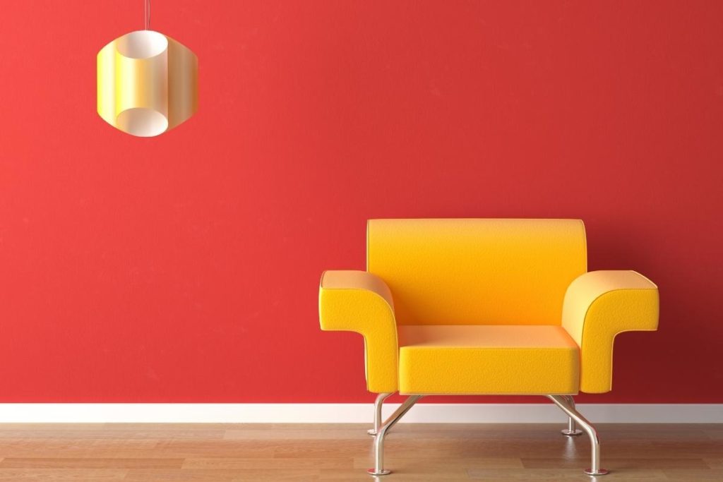
Yellow
Like orange, yellow is also a lively color that goes surprisingly well with certain shades of red. Yellow is a very positive color, making it a great option for homes that need a boost of cheerfulness.
This color combo is a classic. It’s been around since ancient times, and it’s still loved today. The reason? It’s a warm color, which means it warms up spaces.
It’s perfect for bedrooms because it adds warmth and comfort, and it adds brightness without being overly dramatic. It’s also a great choice for kids’ rooms because it creates a sense of happiness and joy.
Yellow is also a great choice for kitchens. It creates a warm, inviting ambience that’s perfect for cooking and entertaining. When choosing a yellow paint color, try to stay away from dark tones. They’ll probably clash with the rest of your decor. Instead, opt for a brighter hue that brings out the best in your kitchen.
It’s also a versatile color. While it’s most commonly associated with kitchens, it works just as well in most rooms, including bathrooms, dining rooms, and living rooms.
The key to using yellow successfully is to pick a light shade. As we said, darker hues tend to overwhelm the space they’re in. They make everything seem dingy and drab. Pick something that’s not too bright, though. A soft yellow will work perfectly.
It’s easy to see why this color combo is so popular. It’s a classic that never goes out of style. If you’re looking to add a splash of sunshine to your home, consider painting your walls this vibrant color alongside some cherry red accessories. It’s certain to bring life to any room.
Pink
This color is known for being feminine and sweet, and while paired with a lovely shade of red, it can create an incredibly romantic vibe.
Pink has long been used in nurseries, children’s rooms, and flower shops, but it’s also gaining popularity in adult interiors. Pink is a fun, playful color that makes people smile. It’s also a good choice if you want to give your home a fresh new look.
Pink is, essentially, a pastel shade of red, meaning that the colors are similar but not identical. This allows you to use pink in places where red would be overpowering. For example, you could choose a lighter shade of pink in a child’s bedroom than you would a deep, rich red.
When selecting a pink paint color, don’t go overboard on the saturation. You want to keep it subtle. This allows the true beauty of the color to shine through.
If you’re considering using pink in a bathroom or laundry room, avoid going too bold. You don’t want the color to dominate the space. Choose a more muted shade instead.
When pairing pink with red, think about how much contrast you’d like between the two colors.
If you have a lot of white furniture, you may want to stick with a softer pink. If you have lots of black accents, you might prefer a deeper, richer shade of pink.
Overall, pink is a beautiful color that’s sure to make anyone feel happy. It’s especially nice when paired with red, which gives the combination a unique, romantic feel.
Blue
Depending on which shades you are using, red and blue can look amazing together. The two colors compliment each other beautifully.
Blue is a calming color that helps us relax, while red is energizing and uplifting. Together, these colors create a powerful energy that’s both exciting and relaxing at once.
If you’ve got a small space, you should definitely consider using a blue-and-red palette. These colors are very complementary, and they create a feeling of calmness and serenity.
However, if you have a larger space, you’ll probably want to stay away from this color scheme. Both blues and reds tend to get overwhelming in large spaces, so when combined, they can become quite loud.
To pair blue and red, try choosing a shade of blue that’s close to the color of your walls. If you’re working with a dark wall, you’ll want to select a brighter shade of blue, like teal. If you’re working on a light wall, you’ll want something darker: navy blue and red actually work really well together.
You can also experiment with different hues of red. When pairing red with blue, you want to find a shade that complements the color of your walls without dominating them. A bright red will take over a space, so you need to find a shade that’s just right.
In general, blue and red are excellent color combo when used correctly. They’re easy to mix and match, and they can look great together.
Gold
The classic gold and red combo are one of the most popular color schemes for any room. Gold and red are perfect for creating a warm, cosy atmosphere.
Gold is a vibrant, cheerful color that brings out the best in red. It creates a wonderful balance between the two colors.
Red and gold are a classic color combination that works perfectly in any type of home decor. Whether you’re looking to add some warmth to your living room or you want to give your kitchen a new look, this color scheme is sure to do the trick.
A good way to use this color combination is by painting the walls a deep red and then adding touches of gold throughout the room.
You could also paint the ceiling a rich golden yellow, then apply gold trim around windows and doors. Finally, you could add gold accessories such as picture frames, lamps, vases, and even throw pillows.
When it comes to using gold and red together, there are no rules. There are only guidelines. If you want to go bold with this color combination, you might choose a deeper shade of red than you would normally use. On the other hand, if you want to keep things subtle, you can opt for a lighter shade of red.
Either way, you’ll still end up with a gorgeous room that looks fabulous. So don’t worry about whether you’re going too far with this color scheme. Just make sure that you pick a shade of red that fits comfortably within your budget.
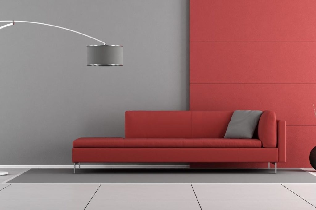
Gray
Gray is one of those versatile neutral colors that goes with almost anything. This color has a calming effect, which makes it perfect for bedrooms and nurseries. Gray is a great choice for rooms where you want to achieve a peaceful vibe.
When combined with red, gray becomes a beautiful backdrop for any room. The two colors compliment each other beautifully, and they create a soothing ambience.
If you’re planning on using gray in conjunction with red, you’ll want to avoid using black accents.
Black tends to overpower gray, making it appear drab and boring. Instead, you should stick to accent pieces made from white, cream, tan, or off-white. These colors will bring out the natural beauty of gray.
To pull off a successful gray and red color scheme, you need to find a shade of red that complements the gray. A darker shade of red will work better than a lighter one.
Also, remember that you can never have too much red in a room. Too much red can overwhelm the space, but just enough will make the room feel warm and inviting.
To keep things interesting, you can mix different shades of gray into your design. You can start with a light gray and gradually build up to a dark gray.
Or you can begin with a dark gray and slowly fade it down to a light gray. Either way, you’ll get a stunning result.
You can also try mixing gray and red tones together. For example, you could paint the walls a medium gray and then add touches of red throughout the room. You can also use red accents like rugs, curtains, and artwork.
Beige
This soft, muted color is another popular option when it comes to creating a calm atmosphere, even when used alongside a brighter red.
It’s a nice alternative to gray because it doesn’t come across as cold or dull. Beige works well in both modern and traditional spaces.
The best thing about beige is that it can easily transition between different styles. This means that you can use it in contemporary settings without having to change the entire look of the room. In fact, you can even incorporate beige into more traditional decorating schemes.
If you decide to combine beige with red, you’ll probably want to keep the amount of red at around 20 percent. That way, the overall look won’t become too intense.
However, if you do plan on adding red to your beige palette, you’ll want to select a deep shade of red. Otherwise, the combination will turn out looking very bland.
Another good idea is to use beige as a base color for a bedroom. Then, you can add pops of bright red here and there. By doing so, you’ll give your room an updated look while keeping its traditional style intact.
A good rule of thumb is to choose a shade of red that’s similar to the tone of the beige. If you go too far with the red, the room may end up feeling overly bright and busy. Conversely, if you don’t add enough red, the room might not seem lively enough.
Green
Last on this list, we have chosen a highly controversial color to use alongside red. Green has been known to clash with many other colors, including blue and yellow. But it’s also a great choice for those who love bold hues.
Some people think of it as being cool and calming, while others see it as being energetic and exciting. As a result, some homeowners prefer to avoid using green altogether.
But if you’re willing to take a chance, green can actually work quite nicely with red.
The reason why is that green tends to bring out the warmth in red. According to color theory, green and red are complementary colors, so if you pair these two colors together, they’ll create a harmonious whole.
As long as you pick a shade of green that’s close to the tone of the red, you should be able to achieve a pleasing effect. Of course, you’ll need to make sure that the rest of your home isn’t too saturated with green. Otherwise, the room will feel too loud and overwhelming.
Green and red used together is definitely not a popular choice for the average homeowner, but if you’re brave enough to try it, you’ll find that it can really enhance the mood of any space. Just make sure that you don’t overdo it.
A little goes a long way when it comes to incorporating green into your space.
Final Thoughts
In conclusion, red is a common color used in many ways. From clothing to furniture, red is often seen everywhere.
This is because it goes well with almost anything and is also very eye-catching. When choosing a new piece of furniture or home decor, red will always stand out.
When deciding on a color scheme for your home, use these tips to choose the best colors that go with red. Ultimately, the decision is yours, but hopefully, this article gave you some helpful insight.
I’m Ida Oliveira, and now I want to impart my knowledge of all things interior design onto you. If you’re going through the same process of designing your house, I want to help.
So, I hope that you’ll find everything you need to know on my website. If I make the process even a little easier and more fun for you, Alexander and Pearl will have done its job.


![ow To Design A Room Like An Interior Designer [Step By Step]](https://alexanderandpearl.co.uk/wp-content/uploads/2022/02/How-Much-Does-A-Pop-Up-Camper-Weigh-33.jpg "How To Design A Room Like An Interior Designer [Step By Step]")


")

