Its deep, warm shade of brownish-gray gives it a modern and sophisticated look, perfect for the home.
It can be used in a variety of spaces, from living rooms and bedrooms, to kitchens and bathrooms, and pairs well with a range of other colors and materials.
Over the last few years, bolder darker color choices have grown in popularity and Urbane Bronze is a favorite of many designers around the country.
If you’re considering transforming one of your rooms or accenting a wall with Urbane Bronze, it’s important to understand how it works as a color and how it can be incorporated into your design scheme.
This complete guide on using Urbane Bronze by Sherwin Williams in your home will provide you with all the information you need to know about the paint, including its undertones, complementary colors, and the best ways to use it in different rooms and settings.
Urbane Bronze Undertones – What Are They?
Urbane Bronze is a rich brown paint color that has subtle gray undertones. Moreover, this color also features a hint of green undertones that can be brought out when paired with warm wood or wood accents.
Although the green undertone can add a beautiful dimension to the color, it’s important to note that it may not be desirable for everyone.
Hence, if you prefer to avoid any green hues, it’s best to be cautious while using Urbane Bronze in your decor.
Colors That Pair Well With Urbane Bronze
Urbane Bronze pairs excellently with a range of colors, as it has a neutral tone. That being said, it pairs best with those that have warm undertones, too. Urbane Bronze itself features a warm, bold brown undertone.
Therefore, paints that possess warmer undertones or are on the warmer side of the color spectrum will appear best with this paint.
Any color with cool undertones, such as purple or blue, can result in a harsh combination that will not be aesthetically pleasing.
For instance, if you want to pair a trim color with Urbane Bronze, choose one like White Dove with greater warmth to it.
Warm gray colors match well with Urbane Bronze, as well as light greens, and off-white or cream tones.
Here are some colors that coordinate well with Urbane Bronze:
Light warm grays – Worldly Gray, Amazing Gray, Modern Gray, Agreeable Gray, and Anonymous Gray
Light greens – These help bring some additional color to your room. Some examples are Sea Salt, Tidewater, Rain, Retreat, Basil, Halcyon Green, and Acacia Haze
Creams – Alabaster, Pure White, and Shoji White
Trim Colors That Pair Well With Urbane Bronze
When it comes to pairing Urbane Bronze with a trim color, it’s best to go with a bright white or soft white tone. Nevertheless, this essentially depends on how crisp you want your trim to be.
Here are some great trim colors that match well with Urbane Bronze:
Bright white trim tones – Behr Ultra Pure White, Sherwin Williams Extra White, and Benjamin Moore Simply White
Soft white trim tones – Benjamin Moore White Dove, Sherwin Williams Alabaster, and Behr Cameo White
Where To Use Urbane Bronze In The Home
Urbane Bronze is a versatile paint color that can be used in various ways to add a touch of elegance and sophistication to your home.
Whether it’s to accent walls, for front doors, or cabinets, Urbane Bronze can create a dramatic effect and enhance the overall aesthetic of your space. You can even use it on your home’s exterior walls.
The bright outside light will lighten how the color looks, too, giving your home a unique, smart color tone.
Moreover, you can even use it for entire rooms without hesitation. Despite its darker hue, Urbane Bronze is still considered a neutral color that can blend in seamlessly with other hues and decor styles.
Urbane Bronze can effortlessly complement black and brown decor in particular, creating a soft yet striking ambiance.
Its ability to pull in other colors and add depth to a space makes it a perfect choice for those looking to add a touch of luxury and refinement to their home.
Decor With Urbane Bronze: Styling Suggestions
As we now know, Urbane Bronze is a supremely versatile color that goes well with many paints and suits most rooms.
But, before you choose to paint a wall, a piece of furniture, or cabinetry, you need to ensure your home’s decor style matches the bold tones of it.
Urbane Bronze has a significant earthy aesthetic appeal. Therefore, you should look to pair it with natural materials and elements.
This will help the color stand out further and work best in the space. Wood, leather, and stone are great pairings as they can add warmth and texture to your room.
Black matte pottery, warm wooden accents, and jute rugs tend to work very well with the warm undertones of Urbane Bronze.
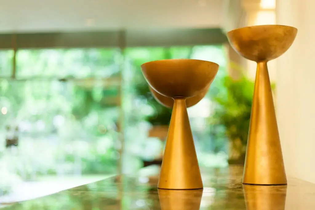
But, warm metal accents, such as copper or gold, also pair well, as Urbane Bronze helps accentuate the metallic nature of these items, providing a sophisticated, warm feel to the room. These accents can add a touch of glamour and luxury, too.
Urbane Bronze helps add depth and elegance to any space, especially when paired with soft textiles, like velvet, linen, or wool. This combination helps create a cozy atmosphere and adds a touch of comfort and softness.
If you want your space to pop with vibrancy and energy, you can try contrasting Urbane Bronze with bright colors, such as yellow, pink, or turquoise.
These are highly contrasting shades, however, and are certainly not to everyone’s taste. Instead, the safer route is to go with neutral colors, like gray, beige, or white.
These colors will help create a calming and sophisticated atmosphere.
Statement artwork adds drama and visual interest to a room as well. When Urbane Bronze is behind the artwork, it can act as an excellent backdrop, whether it be a sculpture or a painting.
And, finally, as we discussed above, any greenery, such as flowers, work wonderfully with Urbane Bronze. Greenery can provide a space with a natural serenity and bring some life to the room.
Tips When Choosing Accent Colors For Your Home
There are some considerations when selecting accent colors for your home to match Urbane Bronze. Firstly, you’ll want to opt for a neutral color scheme to help bring out a burst of colors.
Shades of beige, gray, or white are the safest options you can go for. But, although safe, you can design your space around these to make it unique and extremely cozy.
If you want the colors to pop more, you will need to consider the color family you should get. Warm tones like gold or cooler shades like blues can work well when used correctly, but may appear a little harsh when used in the wrong places.
You should think about things that do not change in your home, too, such as kitchen cabinets, flooring, and trim colors.
Yes, they can be changed, of course, but these may be areas of your home that you do not plan to change any time soon. Therefore, you should opt for colors that pair well with their tones.
The lighting in your home should also be of key consideration. If your space tends to get a lot of natural light, then darker colors, like dark gray, may be the way to go, as they will appear brighter and lighter.
Lighting can have a significant effect on the colors of your walls. Look at your wall colors in the daytime and nighttime, and you will see a difference, and see if you like them at both times. If so, you have your new color scheme!
How To Choose Accent Colors?
When you’re shopping for new accent colors for your home, simply pick up a paint swatch or paint sample of Silver Strand and take it around with you.
As you shop, just pull the sample out and compare with the color you’re considering. See if they coordinate and decide whether you want to opt for that accent color or not. Easy!
Colors To Avoid With Urbane Bronze
When it comes to choosing colors to pair with Urbane Bronze, there aren’t necessarily any hard and fast rules. However, there are some colors that may not complement Urbane Bronze as well as others.
Here are a few colors to consider avoiding when using Urbane Bronze in your decor:
Cool Blues – Cool blues, such as baby blue or powder blue, may clash with the warm, earthy tones of Urbane Bronze.
Bright Pinks – Bright pinks can create too much of a contrast with Urbane Bronze, and may not blend well with its muted tones.
Bright Oranges – Like bright pinks, bright oranges can be too bold and clash with the rich, earthy tones of Urbane Bronze.
Pastel Yellows – Pastel yellows may not provide enough contrast to Urbane Bronze, and can appear washed out when paired together.
Bright Greens – Bright greens may be too overwhelming when paired with Urbane Bronze, and may clash with its subtle green undertones.
Bright Purples – Bright purples may not complement Urbane Bronze as well as muted or darker shades of purple.
In Summary
When using Urbane Bronze in your home, the best way to determine what colors and decor pair well is to experiment and find what works best for your specific space and personal taste.
Make sure you save this article to revisit when you’re designing your home with Urbane Bronze next.
I’m Ida Oliveira, and now I want to impart my knowledge of all things interior design onto you. If you’re going through the same process of designing your house, I want to help.
So, I hope that you’ll find everything you need to know on my website. If I make the process even a little easier and more fun for you, Alexander and Pearl will have done its job.

![ow To Design A Room Like An Interior Designer [Step By Step]](https://alexanderandpearl.co.uk/wp-content/uploads/2022/02/How-Much-Does-A-Pop-Up-Camper-Weigh-33.jpg "How To Design A Room Like An Interior Designer [Step By Step]")

")

")


