I’m a little sick of seeing greige at this point, and white and cream already take pride and place in many of my other rooms. So, I put my thinking cap on and went on the hunt for something new and unique.
Enter gray-green.
Believe it or not, it is a really great neutral color. It has that gray undertone that really compliments that lighter green hue.
It’s not in your face, it doesn’t clash, but it also adds a little extra color to the room. It’s the perfect choice.
Then, of course, you have to find the right shade of gray-green. And there are plenty of options available.
So many, in fact, it can be a little mind-boggling to actually even begin to choose. I did eventually settle on a color, and I must say, it looks amazing.
But it left me thinking, others may also have this shade dilemma. So I thought I’d compile a list of the 11 best shades of gray-green out there.
Picking between them will still be a monumental task, but it should ease the burden for you.
Let’s get into it!
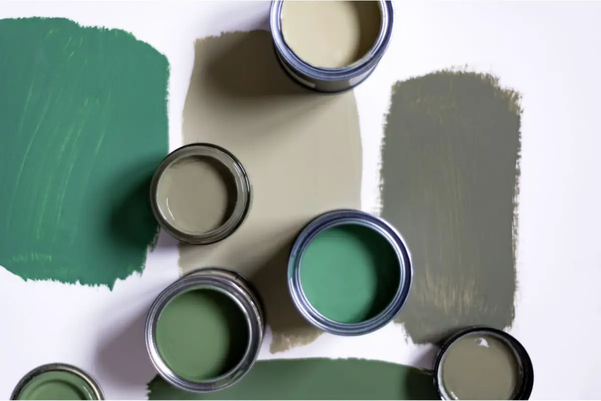
Gray-Green Paint Colors
I find with a great gray-green, you’re looking for that perfect balance. You don’t want it to be too green or it ends up clashing. You don’t want it to be too gray either, otherwise, you lose that nice hint and pop of color.
Below are all great options that handle the balance between the two hues perfectly.
I adore this color, the green hue is very soft and subtle but is still very obvious there. It’s then complemented amazingly with those slight gray undertones that give it a more neutral feel.
If you’re looking for a shade that hints only slightly at a soft green color with just a pinch of gray then you couldn’t find a better option.
This color I would say is more gray dominant than it is green, but the green is still definitely detectable. If you’ve seen the shade Horizon and liked it, then you’ll adore this color.
It is essentially very similar with just a pinch of green added to the mix. If you want to just dip your toes out of your comfort zone without committing fully to a new and bolder color, then this is the option for you.
This shade opts for a darker shade of green than a lot of the other options on the market and I believe it is also the darkest on my list today.
When dry it comes out as this gorgeous olive color that does seem a little bit lighter thanks to the gray undertones. If you’re looking for a slightly darker shade for your green-gray walls, then this is the one.
On the other scale of shades, we have liveable green which has an incredibly light green hue with a few subtle gray undertones coming through.
This pale color is amazing for opening up smaller rooms but works well no matter where you put it.
The only thing I will say about this color is to be aware of the lighting. If you have minimal light in your room, the color doesn’t look as good as it does in ones that are basked in sun.
The more light your room has, the paler and prettier this shade tends to be.
This color is definitely more green-dominant than it is gray, but it is a very pale and light green that shines through.
It’s very pretty but again, I would recommend using it in rooms with windows or access to light. When the room is darker the shade can tend to look closer to a beige than a green-gray.
Okay, so I may have cheated a little by sneaking this one in. I’d say it’s probably closer to a green-blue than it is a green-gray, but there are definitely hints of gray within it.
And honestly, it’s such a pretty shade I just couldn’t bring myself to ignore it.
This looks amazing on the walls, but it’s a bit of a shape-shifter. There are a few different undertones in it so a lot of factors can change what the exact shade will look like in your home.
I’d definitely recommend trying a sample of this before purchasing a whole tub.
Imagine a true sage shade and then just add a whole lot more depth, and boom, you’ve got Silvermist by Sherwin Williams. This subtle sage color has these beautiful blue and gray undertones that come out really nicely.
We’re back to another gray-dominant color now. Silverpointe is unquestionably a gray paint color, but it has such a striking green undertone that is absolutely to die for.
When you paint this shade on the walls you get a striking gray color with hints of green shining on through.
However, because it has two undertones, I’d recommend taking home a sample before fully committing.
And a top tip, to really highlight that green undertone, use green decor in the room you are painting and watch the color transform!
This color is so pretty – it might be one of my favorites. It’s the color I opted for in my living room. It comes out as this very light olive green color that is simultaneously subtle and stunning.
Again, a little green decor goes a long way to transform a room when using this paint color.
This smoky green color is bold and beautiful. It’s an army green shade that when combined with the gray becomes very subtle yet striking.
If you’re adventurous and brave and love to opt for something a little different then you’ll definitely make a statement by giving your walls a lick of Green Smoke.
I’d advise pairing this color with off-white and mustard yellow.
This color has gained immense popularity as of late, and rightfully so. It’s such a show-stopper. It has this very deep green hue that is then complimented amazingly well with the greige undertones.
It’s quite a dark shade, and I would recommend only using it in areas where the room has access to an abundance of natural light to really get the most out of it.
The Importance Of Samples
I cannot stress enough how important it is to sample a paint before you commit to it.
You can fall in love with a color in the store and due to the amount of light, and the decor that you choose, it can look like a totally different shade once it’s on your walls.
Also, there are so many different colors to choose from that sometimes it can be really difficult to choose a favorite.
So opting for a few samples and popping them on your wall is a great way to make your decision process a little easier.
I would definitely recommend checking out Sampilize when it comes to samples. You can pick out your desired shades and then they’ll send you 12×12 sheets of a peel-and-stick piece of paper.
It’s really easy to apply to the wall and you save yourself all the faff of painting and then waiting for it to dry. You can simply place it on and voila, you can make your decision.
Testing Samples Correctly
You wouldn’t really think that there is a right and wrong way to try out samples, would you? But there is. So when it comes to sampling your gray-green shades of choice, you’ll want to follow the steps below.
Don’t Overindulge
I’ve only skimmed the surface of the many shades that are available, and that’s still eleven different shades to choose from.
There are just so many colors to pick from that you can be tempted to get tons of samples. But you’ll just end up overwhelmed and stressed, and ultimately unable to pick.
Opt for no more than 5-6 colors overall, maximum, and then see how you find them. From there you can move more toward greener or grayer shades depending on your preference.
Undertones & Fixed Elements
You are going to want your undertones to match the room that you are painting.
So you want to pay close attention to the undertones in your paint and how they will pair with any fixed elements or furnishings in your room.
It’s a lot easier to change the shade of paint that you have than it is to replace a fireplace, couch, or lighting fixture, for example.
It is important to ensure that the colors in your fixings do not clash with your paint and its undertones.
Research & Compare
It’s easy to think I want a gray color, and gray is gray, right? Not really, you could put eight different gray shades together and they will all look completely different.
Some will be darker, some will be lighter, some will have blue undertones, some green, along with many other options.
So make sure to really take a look at what you’re looking for. Do some research and a whole lot of comparing before you even begin to think about settling for a particular color.
White Walls Only
Do not place your sample on an already painted wall. The color of the wall will impact the sample and how the color looks in the room.
To really know what the color is going to look like in that room, it’ll need to be placed on a white background. So paint a decent section of the wall white before you start applying any of your samples.
Otherwise, when you come to paint the wall, you may find that it looks like a totally different color again because of the distortion from the old paint color.
Final Thoughts
Decorating a room is so much fun, it’s really a wonder to behold how just a change in color can totally transform a room. It can really feel like you’re in a whole new home once you’ve finished redecorating.
And you can’t pick a better color for your room than gray-green. It is one of the most beautiful, striking, and yet subtle colors that works amazingly well because it is also neural.
And now that you know all the best shades, and how to go about sampling them, this is where the real fun can begin.
Get researching, and then embark on your gray-green journey today!
I’m Ida Oliveira, and now I want to impart my knowledge of all things interior design onto you. If you’re going through the same process of designing your house, I want to help.
So, I hope that you’ll find everything you need to know on my website. If I make the process even a little easier and more fun for you, Alexander and Pearl will have done its job.

![ow To Design A Room Like An Interior Designer [Step By Step]](https://alexanderandpearl.co.uk/wp-content/uploads/2022/02/How-Much-Does-A-Pop-Up-Camper-Weigh-33.jpg "How To Design A Room Like An Interior Designer [Step By Step]")

")


")

