The same goes for when decorating your home. However, this color has gotten an unfair rap and can be used to brighten up an otherwise drab home.
The best thing about Accessible Beige is the fact that it can be paired with a lot of other colors.
Whether you are looking to match magenta or blue-green, then beige is a great color to include in your home decor. There is a reason why this color has been dubbed ‘accessible’.
So how will this color transform your home? What other colors can you compare Accessible Beige to? Is it a warm color?
We’re going to do a deep dive on Accessible Beige, giving you all the information that you need before you commit to a purchase.
What Colors Are In Accessible Beige?
There are a few subtle undertones in Accessible Beige that you should be aware of when you are pairing it with other colors.
Although you might not be able to see it at first, this color comes in shades of green.
However, the green is not too heavy and means that you can pair it with other colors on this end of the spectrum, like turquoise and aquamarine. This also allows you to pair it with darker blues and greens.
There is also a little bit of pink in beige, which means that you can pair it with other colors like terracotta and salmon.
If you are looking to create a range of tones within a similar color spectrum, then we would certainly recommend blending in a bit of Accessible Beige.
This does really contain any colors in the yellow spectrum although you can certainly pair it with very muted forms of yellow shading.
Accessible Beige – Will It Make Room Seem Warm Or Cold?
The main thing that you should bear in mind when it comes to colors is what type of light you are exposing it to. In the bright sunlight,
Accessible Beige becomes a very vibrant and warm color. If you have a north-facing room, this color will really come into its own.
When you are painting your room Accessible Beige, you’ll need to make sure that you check the color of your fittings.
The wall should complement the skirting, the railings and any fixtures that are permanent. If you are painting your kitchen, you’ll also need to think about the kitchen counters and fridge color.
A great color to have with Accessible Beige is white, as both colors really complement each other.
It is actually very difficult to find a pure white coloring, however, as most of them will contain hints of yellow, red and orange.
When you are matching the color of walls with your carpet, you’ll also need to be very selective. You’ll have to consider the texture as well as the color of the carpet itself.
There are some carpets that have pink undertones, which might cause a clash with your Accessible Beige coloring.
We would recommend pairing beige colors with gray, off-white and iron colors. These are in the same lightness as beige and won’t create a color combo that is uneasy on the eye.
In What Rooms Is It Best To Use Accessible Beige?
One of the best things about this shade of beige is the fact that you can use it in pretty much any room. You can paint the inside and the outside of your house in Accessible Beige.
If you do decide to cover your whole house in this color, you can be sure that it will turn into a much warmer and more inviting place.
For a bathroom, this color is also excellent.
If you have silver or brass fittings, then this color is also another easy one. Just look at some pictures of bathrooms featuring Accessible Beige, they are very warm and summery.
A texture that Accessible Beige really works with is dark wood. If you have smaller side tables and shelving that are made from oak or maple, then beige is the ideal backdrop.
This also works with limestone sinks and enamel bathtubs.
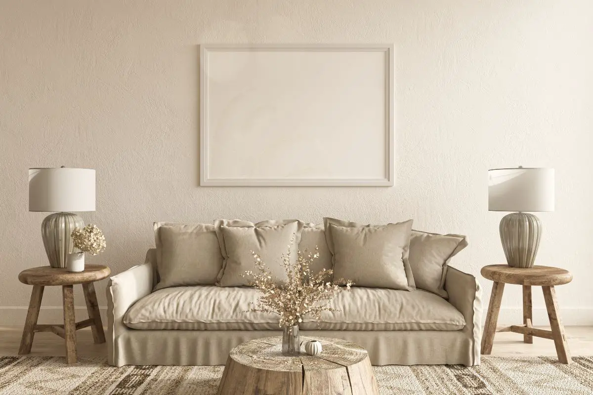
Beige also does well in kitchens and living rooms. In a living room, you’ll really want a warm color that responds well to natural light, goes with white furniture and really works well with silver fittings.
Accessible Beige will suit both a modern-style room or something with a more vintage flair.
What Is The Best Color Trim For Accessible Beige?
Creating a crisp and warm-looking living space is important, which is why you might opt for a color like Accessible Beige. However, you will also need to think about the surrounding colors, such as the floor trim.
This aspect of your room is like a frame around a painting, it should complement and enhance rather than detract and overwhelm.
As we mentioned earlier, off-white colors work well with Accessible Beige. There are colors like Greek Vanilla and Alabaster, which are mainly white with the vaguest hints of pink or yellow.
A List Of Complementary Colors For Accessible Beige
Here is a list of colors that we think pair the best with this unique beige, along with some links where you can gather more details:
As you can see from the color template, this is a cool color that will work well as a bordering for Accessible Beige, almost softening off the brighter aspects of the former color.
This is a color that contains marine elements such as green and blue. This gives off a more natural vibe, a more earthy, anchoring contrast to the airy and light beige colors.
This next color is described as a warm gray and comes with hints of lavender in it, which makes it the perfect complement to the pink-tinged Accessible Beige color.
This is a very soft color that will create a very welcoming atmosphere for anyone who sees it.
You can pair this color with Accessible Beige as the primary color or have it as the secondary color in a range of various shades.
This next color is much more down-to-Earth, again, this will be the perfect contrast and anchoring color to the bright and flighty Accessible Beige. This color is very sophisticated and goes well with brass fittings and bright, vibrant furniture.
This color goes great in any room. You could even have it as trim in your bathroom, as it will go with light and dark tiles.
This pairs with off-white, cream and pale-yellow colors. You can also paint the windowsill of the outside of your house in this color along with AB walls.
Next up, we have a color that is much lighter in tone, having a cozy and warm vibe that will enhance any beige coloring.
This goes well with white and cream-colored furniture, as well as brass and gold fittings.
You could even paint your kitchen worktops in this color, as it is muted enough and will not dominate the room. This color also emanates peace, which is great if you want to paint your bedroom wall with it.
What Is The Difference Between Accessible Beige And Agreeable Gray?
Sharing a very similar namesake to Accessible Beige, Agreeable Gray is very similar in terms of tone and color, although obviously, the latter has a little more grit and darkness to it.
There are some very subtle differences to this color, with Accessible Beige being more beige than gray with Agreeable Gray being more gray than beige.
The two colors are very complimentary and the more dominant colors will show up when placed under the light.
There is a touch of green in both of these colors, although this will also only really show up when you put it under the light.
Accessible Beige is a lot warmer than its gray counterpart, although Agreeable Gray will get warmer when placed under the sunlight.
If you put AG under a low light situation, then the darker tones of the gray will really be accentuated.
Each one of these colors might be preferable for different types of room. For example, Agreeable Gray will be better for bathrooms where you might want to give off a cool, slightly more subdued vibe.
However, Accessible Beige will be a lot better suited to living rooms and kitchens where there will be more light and where you might want to create a more welcoming vibe.
Of course, these colors will also work when painted close together in the same room.
We would recommend having AB for the primary color, with AG on the trim, as this is a darker and more dominant tone.
What Is The Difference Between Accessible Beige And Revere Pewter?
Again, these two colors are very similar in terms of tone, and it might be difficult to separate them. But there are some subtle differences for the more eagle-eyed color enthusiasts.
RP has a little more green in it than AB, so if you have green fittings or a greener color scheme elsewhere, then RP might be a great counterpoint.
As with the comparison between Accessible Beige and Agreeable Gray, AB is a lot warmer than Revered Pewter and would be more suitable for living rooms and kitchens, with RP being more suited to bathrooms.
Conclusion
We hope that our guide to Accessible Beige has given you a new perspective on the much-maligned beige color palate.
This can really reinvigorate your living room or kitchen, making it a much brighter and more welcoming place to spend your time.
I’m Ida Oliveira, and now I want to impart my knowledge of all things interior design onto you. If you’re going through the same process of designing your house, I want to help.
So, I hope that you’ll find everything you need to know on my website. If I make the process even a little easier and more fun for you, Alexander and Pearl will have done its job.

![ow To Design A Room Like An Interior Designer [Step By Step]](https://alexanderandpearl.co.uk/wp-content/uploads/2022/02/How-Much-Does-A-Pop-Up-Camper-Weigh-33.jpg "How To Design A Room Like An Interior Designer [Step By Step]")
")
")


