There are so many different shades of paint that it is actually harder to find exactly the color that you are looking for.
You might have seen the right shade on a street sign or coating a passing car, but how can you then find the paint tin that matches it exactly?
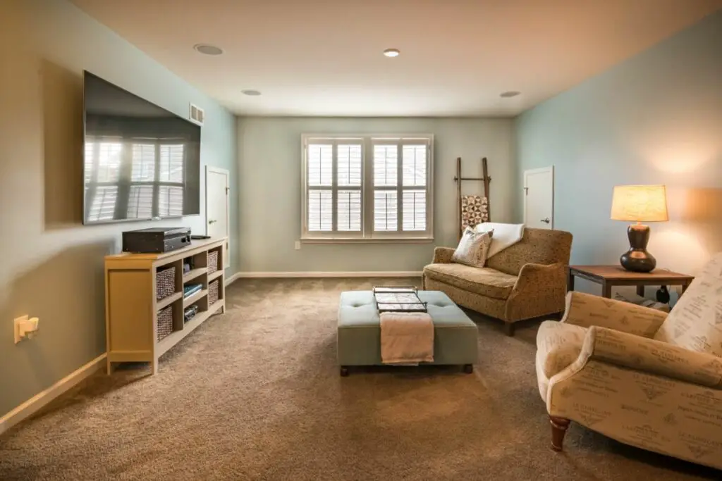
Blue-green is a great color for any home. You can use it to give your bathroom a cool yet upbeat vibe.
You can also coat your bedroom in it, giving you a chilled-out ambiance that will allow you to drift off to sleep after a stressful day at the office.
But how many different types of blue-green coloring are there? How can you find the exact shade that you have pictured in your head? Is there a blue-green color for different rooms in your house?
Well, we have a guide to some amazing colors, along with a brief guide on where to use them and what mood they create.
Best Blue Green Colors
We’re going to break these colors down in terms of lightness and darkness, using the LRV (Light Reflective Value) scale.
The closer to the number 100 the color is on the LRV scale, the lighter it is. We’re going to start with light colors first and work our way darker.
Light Blue Green
Fresh Tone By Behr
LRV: 54
As you can see, this color is very neutral yet serene. It would look great as the color scheme on the walls of a child’s playroom or maybe even a kitchen if you get a lot of natural light that you want to dampen.
This is also a great color if you have a beachside property, as the green-tinged blue really reflects that of the waves and emphasizes that luxurious holiday vibe.
Rainwashed
LRV: 59
This color is very similar to the last one, although it is a few shades lighter and has a little bit of green mixed in.
We would describe this color as ‘family-friendly gray’, as it doesn’t really contain any of the drabness and sadness of gray and will elevate the mood of any room that it paints.
We would certainly recommend that you have this paint shade for your bathroom or utility room. It really has that marine quality that you only get with certain shades of blue-green.
Silver Strand
LRV: 59
We know that a lot of these colors look silver or gray, but we can assure you that they are on the green-blue color spectrum.
This color has a darker undertone, which means that it works very well in rooms that have a lot of natural light, such as a kitchen.
This will give your bedroom or living room that misty quality, which is great for cultivating a sedate mood.
Green Blue By Farrow & Ball
LRV: 65
This next color you can see has that distinctive green overshade that will look great in almost any room.
This is called the chameleon color by the manufacturer, as it will shift from green to blue depending on what light it is exposed to.
During the day, this paint has been described as bluer, whereas in the evening it transforms into a calming green. This is great for anyone who likes that natural feel and will certainly impress your guests.
Palladian Blue
LRV: 61
This next color is simply magical, transferring the drabbest and dullest room into somewhere you wouldn’t mind spending hours of time in.
You might see this sort of color as the main one decorating a spa, with strong oceanic and marine overtones.
This also has the same color as the sky on a cloudless day, which will certainly help to cultivate an air of relaxation in your home. This is also a great color for a baby boy or a unisex playroom.
Opaline
LRV: 72
Now we move on to the darker shades of blue green. This is a foamy sea color, so if you want that sense of natural waves in your house, then you can’t go wrong with this.
You can have this one for your kitchen or, if you have a pool area in your home, it will be the perfect complement to the water.
This is not an overwhelming color and works subtly to instill that sense of calm in your home. This has a mischievous vibe, suggesting excitement as well as relaxation.
Snowbound By Behr
LRV: 80
This snowy color has that brightness behind it that will lighten up the darkest of rooms. You can really see the green in this one, but it is not as stark as most green shades.
This is more of a mint color and many people use this shade to decorate their front doors.
We would recommend that you try this color out first before you buy it because under certain lighting it can have that washed-out feeling.
You won’t want to spend money decorating your whole room in a color that you aren’t able to see.
Sea Foam
LRV: 84
This is a wonderful color to use in a room that has plenty of windows and gets its fair share of light. It will positively glow if you place it under the right color of sunshine.
It will also help to lift your spirits when the day gets dark and gloomy.
This has the ability to really cleanse out the space, imbuing whatever room you paint in natural sea tones.
If you have a house by the beach, then we can think of no better color than Sea Foam by Benjamin Moore.
Dark Blue Green
Waterloo
LRV: 13
This next color might be a little too intense to use across a whole wall, more suited as a complementing color to one of the lighter shades that we have listed above.
However, if you like your strong and bold colors, then this one is great for your bathroom.
This is almost smoky and would also be a great color to reinvigorate a dull office space. There are shades of navy and gray in here too, which is perfect for creating that natural feel.
Inchyra Blue
LRV: 12
This next color is the perfect one for a front door that you want to stand out. It is another shape-shifting color that changes under the light, appearing bluer in the day and greener during the evening.
Therefore, you should also sample this paint first before committing to it. But we can assure you that a lot of people who have used this paint have been very pleased with the results.
It will also help you to hide any dirt and grime you might get on your front door.
Newburg Green
LRV: 8
If you are looking for a paint color that has plenty of wonderful natural hues, then you can’t go wrong with this one.
This is striking and vibrant, again, perfect if you want a color for your front door that will really stand out.
You can also use it as a complementary color to other shades of blue or green.
If you are using this for a bathroom, then you can have an alternating color pattern with a lighter shade of green or a more vivid shade of blue.
Hague Blue
LRV: 7
If you are looking for something that will really leave a strong impression on your guests, then we would certainly recommend Hague Blue.
This has bold green undertones that will be ideal for your bathroom or even painting an outdoor water feature in your garden.
You can also use this one to touch up the skirting boards, creating a bracket around lighter green colors that are painted on the walls. This color is very stark, and we would only recommend that you use it sparingly.
Frequently Asked Questions
What Moods Are Associated With Green Blue?
This is a marine type of color, so it will automatically make you feel calmer and more relaxed. It also is a more natural color, which is also very soothing.
The darker types of green-blue color will add that element of drama to most homes. If you have painted your room from white to dark green-blue, then it will certainly shock visitors.
What Factors Do I Need To Consider Before Painting My Home?
You’ll need to think about how much light gets into your room and the quality of the light.
For example, if your home gets a lot of yellow light in the morning, then this will radically alter the tone of certain colors.
However, if you are getting mostly clear light, then this might not affect your paint too much. You should not just rely on color swatches.
Make sure you are studying a patch of paint for a long period of time under different conditions because once you commit, it will be hard to go back.
What Combinations Of Green Blue Paint Work?
There are plenty of different shades that complement each other, but we would say that you should avoid pairing dark with dark and white with white.
We would recommend having a majority light color and offsetting it with patches of dark green. You can also have a more vibrant green as a breakwater between these two shades.
Conclusion
Getting the right shade for your room is always going to be difficult, which is why it is important to do your research and find out which one will be the most suitable for which room.
We hope that our selection of greens and blues has given you plenty of inspiration.
- Benjamin Moore Palladian Blue Paint: A Color Review - September 5, 2023
- 10 Of The Prettiest Interior Door Colors - August 29, 2023
- Hale Navy: The Best Navy Paint Color - August 22, 2023

![How To Design A Room Like An Interior Designer [Step By Step] ow To Design A Room Like An Interior Designer [Step By Step]](https://alexanderandpearl.co.uk/wp-content/uploads/2022/02/How-Much-Does-A-Pop-Up-Camper-Weigh-33.jpg)
